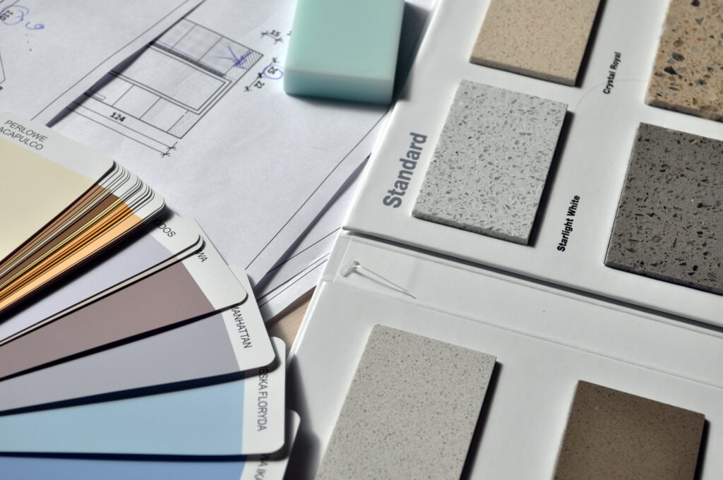
I have been in major decorating, renovating, and designing mode lately! Paint color is always one of the hardest decisions for me. It is truly a mind-boggling task. You have this huge deck of colors and tones in front of you, and you are standing in front of your walls trying to figure out what would look good, and envision it all. Do I go with the classic white? Should I dare do something that pops out? Will this paint color make my home brighter? Will it make the room look small? Would my husband hate it? Is it too girlie? Is it too masculine? You ask your husband, mother, brother, and everyone has an opinion. You are afraid to pick the wrong color and waste your time and money…
Let me make things easier for you by narrowing down your choices and listing the best 10 paint colors. There is nothing controversial here. One of these colors are bound to go with your overall decor. I’ll also talk about the features and benefits of a particular color. For this list, I have chosen Benjamin Moore paints, which is my favorite brand that makes quality paints. However, feel free to use similar colors from a brand of your choice.
Cloud White (OC-130)
If you’re looking for a white shade of paint, Cloud White is a soft color that will brighten up your home seamlessly. This is an ideal color for homes that don’t get enough natural light. In such spaces, white colors are usually the best choice, but this particular shade is even better.
Pink Damask (OC-72)
This shade of pink is more white than pink, which makes it suitable as your primary color choice for your home. It’s a soft white tone with a touch of blush pink that looks pinker in daylight and whiter in the evening.
Calm (OC-22)
You know the color would make your home calm when it’s literally named calm! It’s a white shade with subtle hints of lavender and gray. It’s a cool shade with a soothing impact.
Stonington Gray (HC-170)
This whitish-grey color has neutral undertones and is perfect for homes with a lot of white furniture, cabinetry, and closets.
Linen White (OC-146)
For those who live in colder climates, warm tones are the best choice for home, and Linen White has warm undertones of white and cream. It’s a beautiful color that blends in with any kind of decor.
Shaker Beige (HC-45)
For those who want to go with neutral tones, the shaker beige is the best choice as it’s mostly neutral but can also be warm. If you have a lot of house plants, I’d recommend using this shade as the greens pop out on the beige.
Cushing Green (HC-125)
Green shades for paint are very much in trend these days, and my favorite is Cushing Green, a dark but still not too dark shade of sea green. It’s best to use this in spaces with lots of windows for natural light.
Van Deusen Blue (HC-156)
I like to think this Van Deusen Blue color from Benjamin Moore is part dark blue and part midnight blue. Blue, much like green, has become incredibly popular, especially for kitchen cabinets.
Beacon Gray (2128-60)
This shade of gray has blue highlights, which gives it a cool effect. It can brighten up any space and make it feel cool. It’s ideal for places that are mostly warm all year.
Tarrytown Green (HC-134)
This is another great green color for your home. It has cool undertones and uses pine green as the base. So it also has some influence of blue. You can even use it on just one wall, and it’ll change the whole look of the space.


